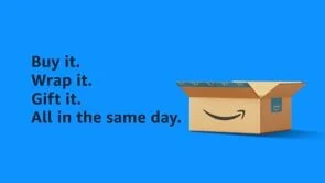
This Christmas, Amazon is reminding shoppers that the big man in red isn’t the only one making deliveries this year. We created dozens of banners, pre-roll, and social assets to encourage Amazon shoppers that everything they need is right here on Prime. Here are a few of my favourites that made the client-cut.
The College of Family Physicians of Canada approached us about creating an emotional spot for the ‘sandwich generation.’ This group of primarily women aged 40-60, faces the near impossible task of caring for their aging parents, themselves, their partners, and their children. We created this spot as a reminder that they’re not alone in the struggle. And whether they’re facing physical, emotional, or mental health issues, their family physician should always be their first call.
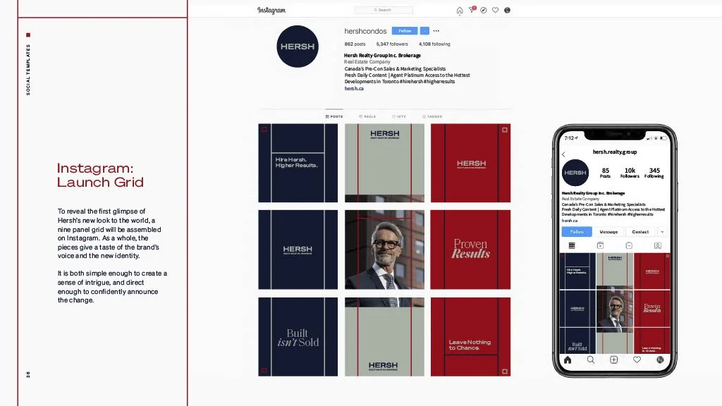
The real estate world is cutthroat, crowded, and competitive. And that’s just buying a property. So, we helped Hersh Realty Group develop a new swagger to set them apart. We gave them a new look, a flexible template to use across all their channels, and a starter kit of complementary copy lines to help launch their new identity.
Strategy: Daniella Perruccio
Art: Ekaterina Garipova
Copy: Joel Cleroux
Client: LCBO
Product: Ready-To-Drink Category
For their spring and summer campaign, the LCBO wanted to refresh their RTD category. So, we gave the summer-inspired cooler class the title of ‘Ready-Mades’ and personified each of the products across 79 print, pre-roll, and OOH executions. Here's a taste.
Art Director: Carly Ouellette
Illustrator: Cameron Harapiak
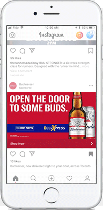
Client: The Beer Store, Budweiser, and Bud Light
Product: Home Delivery
In the summer of 2018, The Beer Store and Budweiser felt this whole Internet fad might just be here to stay. So, they launched a digital campaign to announce you can now order beer online and have it delivered right to your door. (Provided you live in the GTA.) What a time to be alive.
Art Director: Casey Shea
CLIENT: Princess Margaret Cancer Centre
Product: Promotional Video
Every year the Princess Margaret Cancer Centre hosts a sunrise-to-sunset road hockey tournament with local celebrities, Olympians, and NHL enforcers. This year we focused the spotlight on the toughest of them all, a young woman who just beat cancer.
Client: Strongbow Apple Ciders
Product: Strongbow Gold
Strongbow overhauled their look for a sunnier, more premium feel. So, we pulled rich, stunning visuals from the new brand identity and paired them with taste cue and flavour profile headlines to create print and OOH pieces.
1 x Print
2 x OOH
Art Director: Yilma Campbell